
What Makes a Good Website? 6 Must-Haves for Small Business Success
For most customers, your website is the first interaction they’ll have with your business. And just like in real life, first impressions count.
According to user experience (UX) principles, visitors decide whether they’ll stay or bounce within a few seconds. So your website needs to do more than just look good; it has to communicate fast and make it easy to act.
What Makes a Website Great?
You want your website to:
Reflect your brand (colours, tone, values)
Be visually appealing (great photos, good layout)
Communicate clearly (say the right things, not too much)
Encourage action (like booking, calling, or buying)
That’s easier said than done, right? It gets complicated quickly.
Real-Life Example: Who Gives a Crap
Let’s break it down using a great example. The Who Gives a Crap website does this really well, and small businesses can take a page from their book.
The First Five Seconds Rule
This is straight from UX design theory… Visitors should understand three things within five seconds:
What you offer
Why you’re different
What to do next
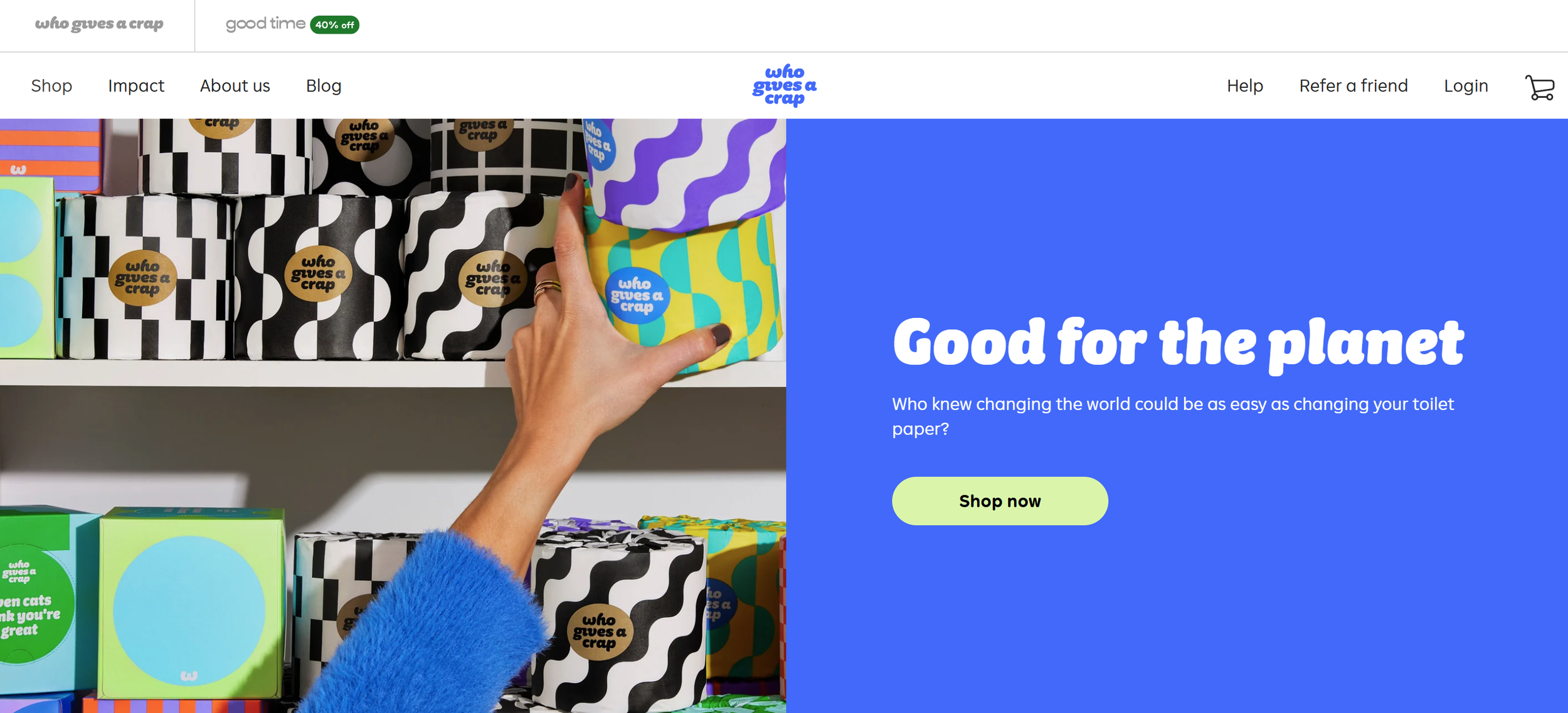
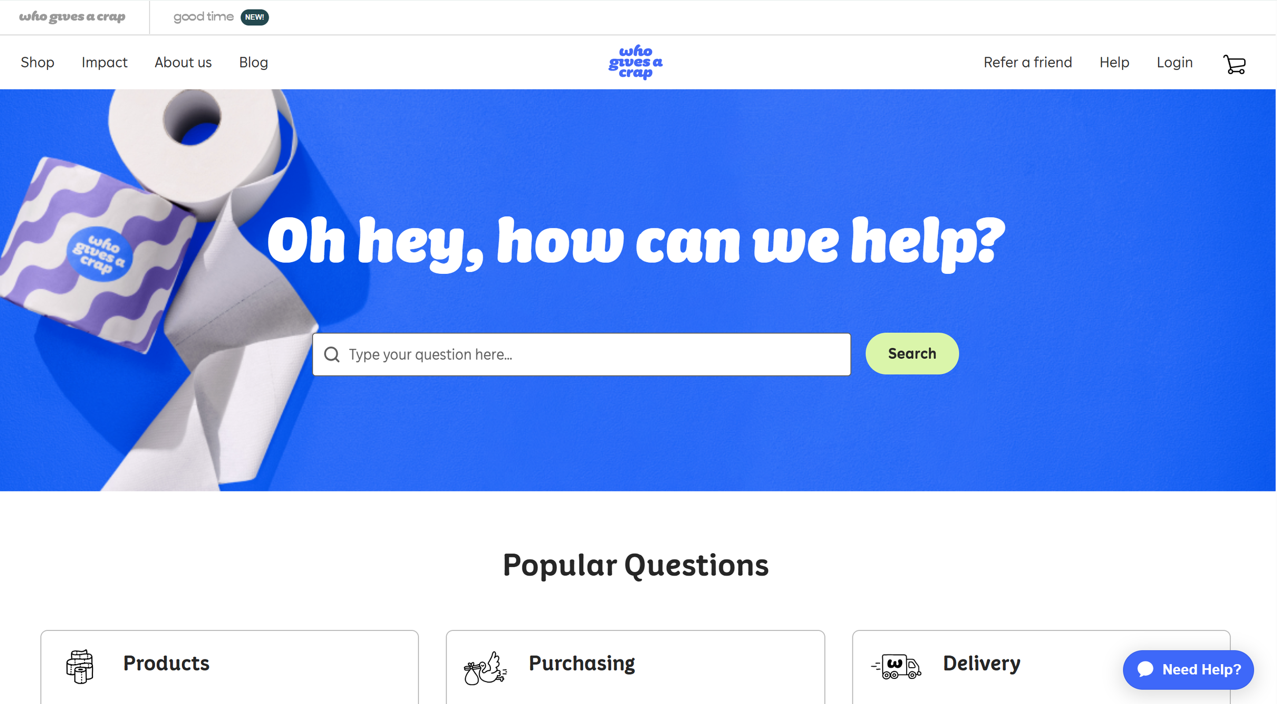
Go to Who Gives a Crap and you’ll see this in action:
Bold visuals of their product (yep, toilet paper)
A quirky tone that reflects their brand personality
A clear call to action - you know exactly where to click
It’s not about packing everything in… it’s about clarity and impact.
Say It Clearly (and Quickly)
Take Who Gives a Crap’s headline:
“Good for the Planet.”
“Who knew changing the world could be as easy as changing your toilet paper?”
In just a few words, they’ve nailed:
What they sell (toilet paper)
What they stand for (planet-friendly mission)
Why you should care (it’s simple and impactful)
This is the power of a strong headline. No confusion, no jargon, just clarity.
What Do You Want People to Do? (Hint: Tell Them!)
Right below their headline, there’s a “Shop Now” button.
That’s called a Call to Action (CTA), and it’s really important.
Why CTAs Matter:
Without one, people won’t know what to do next (buy, book, call, sign up…?).
With one, you guide them to take action, not just browse and bounce.
CTAs turn your website into a tool, not just a brochure.
Best part? You can track them. Know what works, tweak what doesn’t.
Your CTA is a friendly nudge that says, “Hey, here’s what to do next!”
Your Quick Checklist
Want to get your homepage working like theirs? Start here:
Use a clear, direct headline (ditch the fluffy slogans)
Add a bold image that shows your product or service
Make your CTA stand out—don’t make people guess
Help People Find What They Need (Fast)
If visitors have to hunt for answers, they’ll leave. It’s that simple.
Your website should feel easy and intuitive.
Here’s what to focus on:
Simple navigation – Only the essentials in your menu
Logical layout – Pages flow in a way that makes sense
Mobile-friendly – Works beautifully on phones and tablets
Who Gives a Crap Does It Right
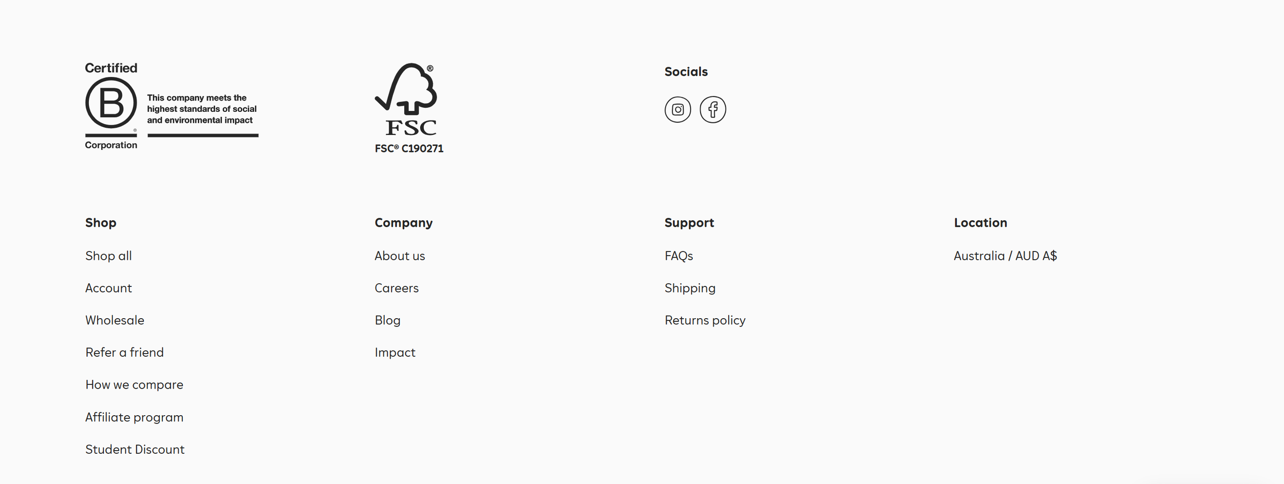
Their top menu?
Shop | Impact | About | Blog | Help | Refer a friend | Login — That’s it.
Every page has a job to do. The product catalogue is clean, easy to browse, and the experience is seamless whether you’re on desktop or mobile.

Show Off Your Personality
Strong Branding = A Memorable Business
Your website should feel like you. Visitors should instantly pick up your personality, values, and mission, without needing to read a whole “About Us” page.
Look at Who Gives a Crap:
Their colours are bright, bold, and playful
Their tone is cheeky, fun, and casual
Even their product descriptions make you smile
This isn’t just about aesthetics, it’s about creating an emotional connection. When your brand has a personality, it becomes more relatable, more memorable, and more human.
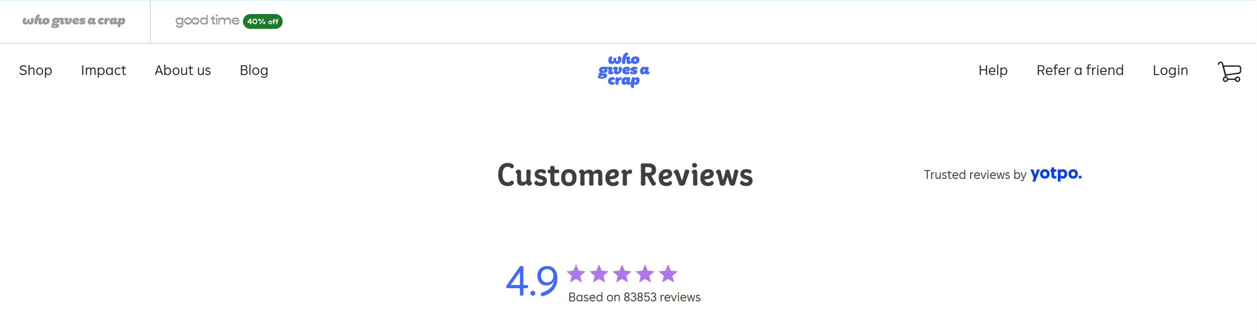
Build Trust with Social Proof
People trust people, not businesses.
If someone is on the fence, seeing real reviews and results can make all the difference.
Who Gives a Crap gets this right:
Over 80,000 customer reviews
$18 million donated to charity
Fun, authentic testimonials are scattered throughout the site
This is called social proof, and it taps into something powerful: “If other people love this, I probably will too.”
Build Trust Through Social Proof
People buy from businesses they trust.
And one of the fastest ways to earn that trust? Show that others already believe in you.
This is called social proof, and it’s more than just a nice-to-have; it’s a psychological trigger. When visitors see others trusting your brand, they feel safer doing the same.
Here’s how to build it in:
Customer testimonials – Real voices, real stories
Before-and-after results – Show the transformation
Credible stats – Numbers like “10,000+ happy customers” or “97% satisfaction”
Trust badges – Certifications, awards, partnerships, or secure checkout icons
Just like Who Gives a Crap uses reviews, donations, and fun testimonials to build credibility, you can too, whether you’re just starting out or already growing.
Looking to increase trust? Start by:
Adding testimonials to key pages
Sharing measurable impact or outcomes
Including real customer photos
Displaying recognisable trust indicators
Be Real. Be Clear. Be You.
Transparency & Authenticity Matter
People can spot BS a mile away. And they don’t like it. When someone visits your website, they’re asking:
“Can I trust this business?”
That trust starts with clear, honest communication.
Your content should openly explain:
What you do
How you do it
What it costs (or why it costs that much)
Your policies, processes, or limitations
No fine print. No fluff. Just real talk.
Want to Build Trust? Try an FAQ Page
A Frequently Asked Questions (FAQ) page isn’t just for convenience—it shows you’re:
Transparent
Proactive
Willing to help before you're even asked
Whether it's explaining shipping delays, refund policies, or how your service works, clarity builds confidence, and confidence leads to action.
Make It Easy to Buy (Seriously)
A Smooth Checkout = More Sales
Let’s face it—if the checkout process is clunky or confusing, people will leave. No matter how great your product is.
In fact, research shows that nearly 70% of online shopping carts are abandoned, often because the process takes too long or feels too hard.
Want to reduce that?
Add one-click checkout options
Show a clear return policy
Include customer support that’s easy to find (live chat, email, FAQs)
People want to feel confident and supported (not frustrated) when they’re ready to buy.
Your Challenge: Take a Fresh Look
Pull up your website and ask:
Does it reflect who we are as a brand?
Is it easy to use on both desktop and mobile?
Are we treating visitors like real people or just leads?
Because when your website feels good to use, your business does too.
If it feels like too much hard work or you’re just not sure where to start, reach out to our team. We will help you build a website that you’re proud to show off.